Interior DesignMark Ashby DesignArchitectStouse Design
PROPERTY FEATURED Claire Avenue
By Rachel Gallaher
When a pair of young professionals in Pemberton—a picturesque, heritage neighborhood in Austin, Texas—first called Mark Ashby Design, they were looking to renovate their kitchen.
The house, built in 1939, had classic architecture and period details that the homeowners loved, including pocket doors and 80-year-old moldings. As the initial project details started to evolve, and eventually turned into a whole-house renovation, these details, and the history of the house in general, became a touchstone for shaping the design and décor decisions during the year-long project.
“We initially dubbed this project, ‘the London townhouse,’ says Anne Grandinetti, a senior designer at Mark Ashby Design. “The clients wanted to highlight the acceptable traditional moments inherited from the home. They wanted a European touch mixed with a soft, pleasing color palette to showcase their growing art collection.”
The clients had reached out to the firm right before the pandemic lockdown. Grandinetti recalls meeting with them, doing a walk-through of the residence, and then everything shutting down one week later. “The rest of our meetings took place via Zoom,” she says. “We spent the entire project under restrictions and still managed to pull off a beautiful remodel.”
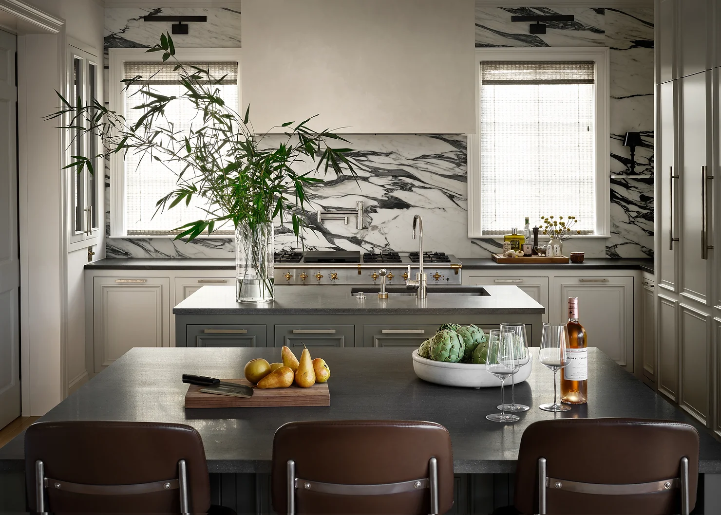
When it came to the remodel, Mark Ashby Design brought on architect Michael Stouse of Stouse Design, and Crowell Builders, to completely gut the kitchen and main bathroom—the two areas of the home getting the biggest overhaul. The design team maintained the structure’s 3,600 square feet, working within the existing footprint to update and refresh the interiors, imbuing them with a refined, but not stuffy, sophistication.
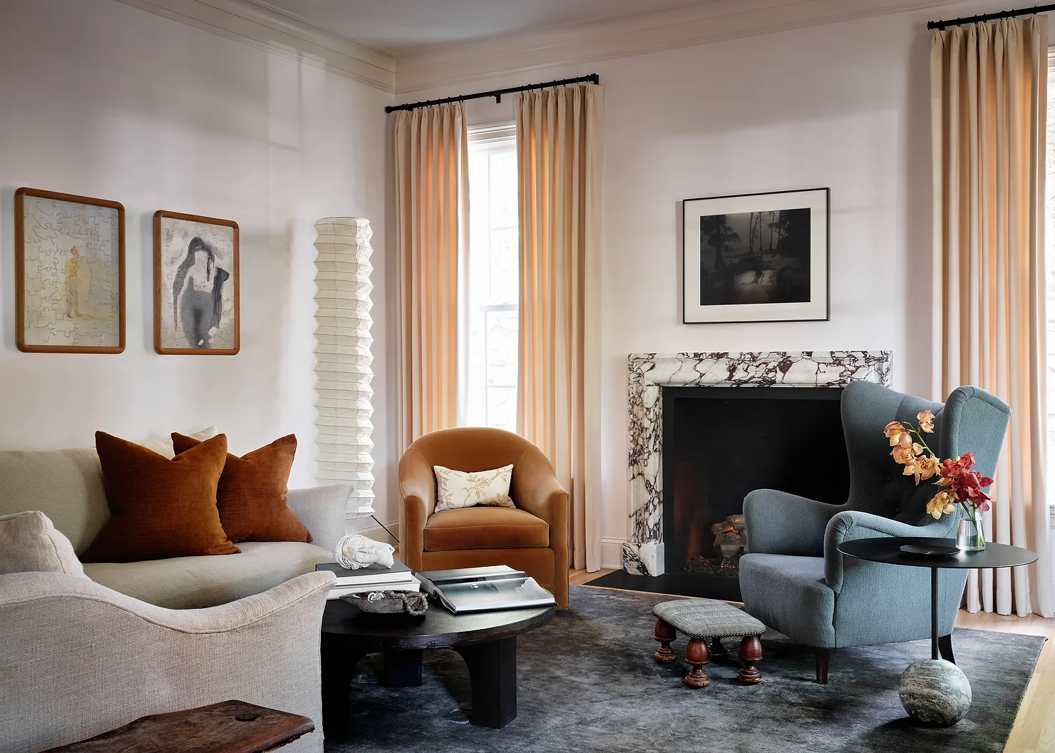
“We always respect the architecture of the home and make sure the exterior and interiors speak to each other in a cohesive way,” Grandinetti says. “While this is a traditional home in a traditional neighborhood of Austin, we made our modern additions subtle in the furnishings, art, staircase banisters, and fireplace stone selections. We plastered the walls in the main bath and shower, adding a European touch to the design.”
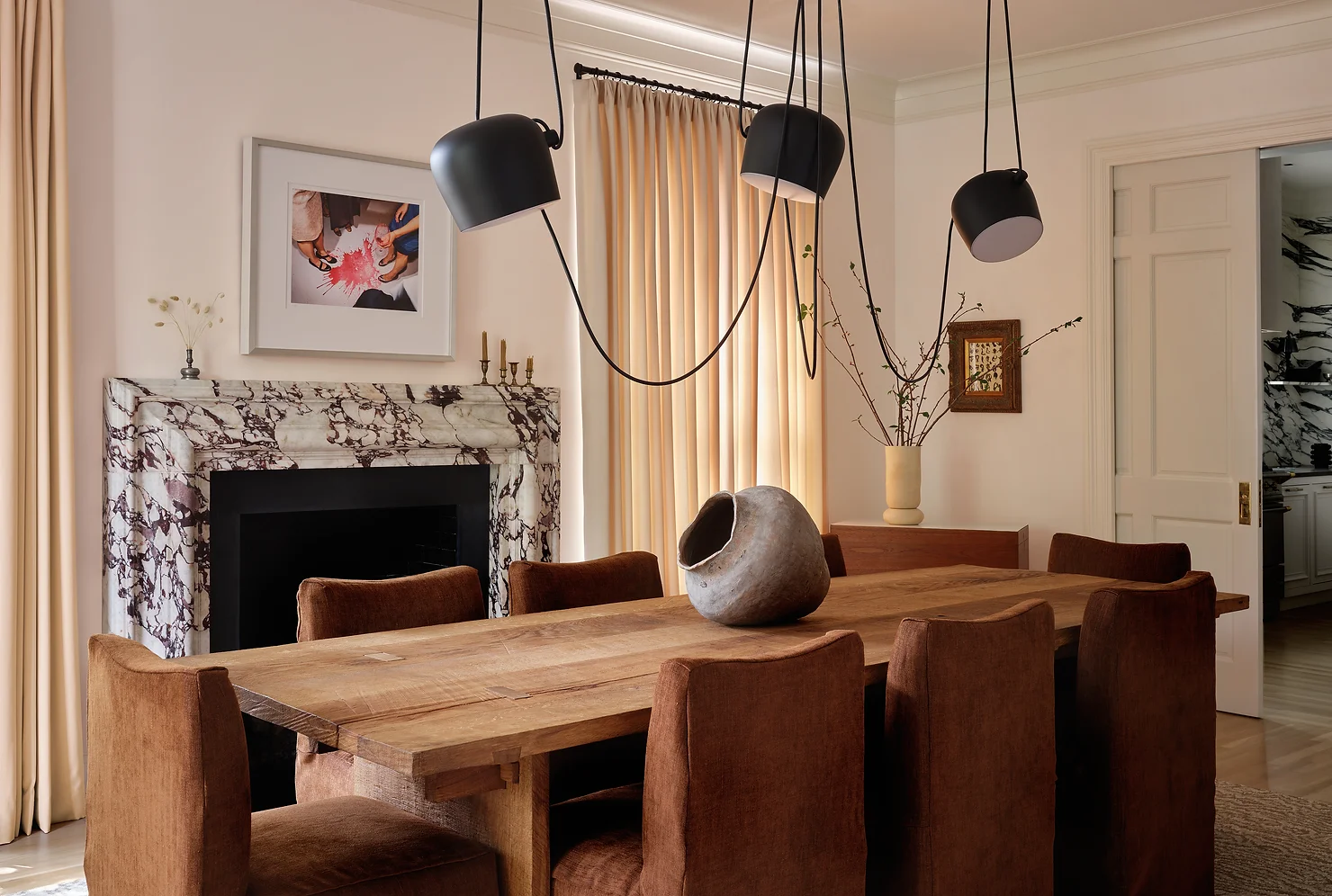
The homeowners prefer a natural color palette—soft grays, blues, and earthy hues are repeated throughout the house—and opted out of large patterns or bold colors. A pair of marble fireplace surrounds sourced through London’s Ryan & Smith, and an arresting black-and-white marble backsplash in the kitchen are statement pieces easy integrate into the rest of the décor, but don’t overwhelm. The Breccia Viola marble of the dining room fireplace was selected for its deep violet veining, which set the tone for the room’s color palette. “We let the design organically evolve,” Grandinetti says. “The clients understood the importance of high-quality finishes and the beauty of mixed materials. This provided a strong foundation for us to build upon.”
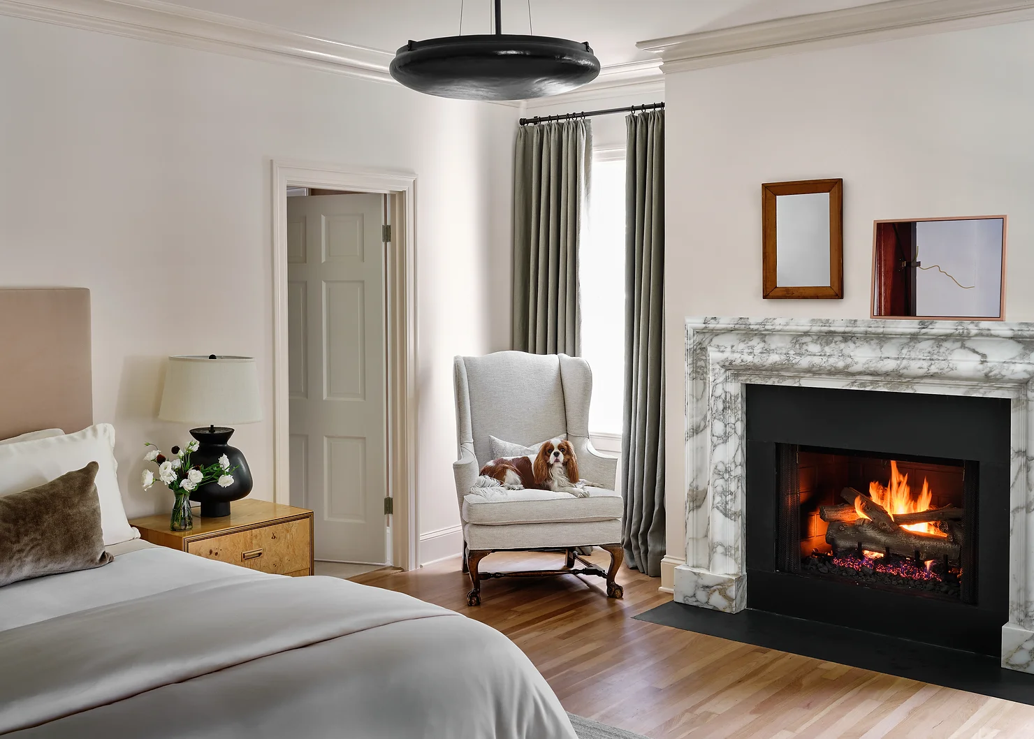
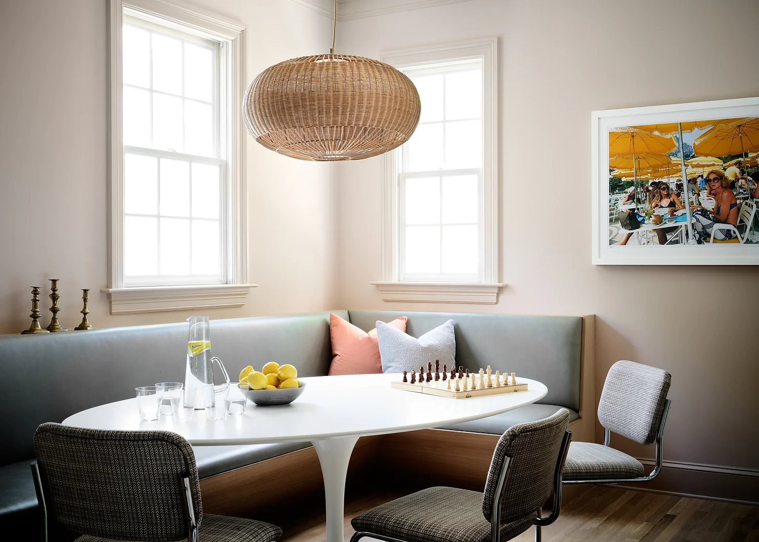
For the clients, the remodel was a fresh aesthetic start—the design team integrated a few treasured pieces. A wing chair that had belonged to one of the homeowners’ parents was reupholstered, and their bed was moved to the guest room to make way for a new one in the primary bedroom. A timeless oval Saarinen for Knoll Tulip Table and a set of Marcel Breuer for Knoll Cesca Chairs complete the breakfast nook and perfectly encapsulates nuance of the home’s classic-meets-contemporary refresh.
