ArchitectFurman + Keil ArchitectsPhotographyPaul Bardagjy
PROPERTY FEATURED Canyon Circle Remodel
By Chris Cobb, AIA
January/February 2018
Project: Woody House
Clients: Maria and Darren Woody
Design Team: Gary Furman, FAIA; Philip Keil, AIA; Jamie Kerensky, Assoc. AIA; Troy Miller; Harrison Marshall; Ann Marie McCollum; Drew Wilson, Assoc. AIA
In the book “Body, Memory, and Architecture,” Kent C. Bloomer and Charles W. Moore define the “test of memorability” that is requisite of a Place. They assert that such Places “facilitate the transaction between body, memory, and architecture which allows us to dwell in them in the fullest sense.” The argument laid out in the 1977 book is rooted in the notion that architecture is not an abstract visual art, but a social art centered on the human body — one that arouses feelings from haptic, sensual experiences.
Moore would build on this principle in his writings, teachings, and (literally) his architecture for the next 16 years until his untimely death in 1993 — and his last completed residential project affirms it. The Austin residence was designed with his then-partner Arthur Andersson, who would faithfully oversee its completion in 1995. After a long stretch of service to its original family, the house welcomed new owners Maria and Darren Woody who, in 2013, discovered it in a serendipitous turn of
events on their house-hunting tour.
Coming from El Paso, the Woodys knew nothing of the history of the house or its legendary architect — but they didn’t need the backstory to feel the power of the place. “Walking through the front door took our breath away,” Maria recalls. “The uniqueness of details, and, of course, the view. You could feel the good bones.”
It wouldn’t take long for the Woodys to become conversant in Moore’s legacy. They dove into his writings, actively discussed his work with local friends, and eagerly explored the Moore/Andersson Compound. Reconciling the importance of the house with their desire to give it new life, they entrusted Gary Furman, FAIA, of Furman + Keil Architects (FKA), to help them preserve the integrity of the original design.
As a former student of Moore’s, Furman was not a surprising choice for the project. In 1987, harnessing Furman’s prior expertise as a professional furniture maker, Moore would employ him to construct displays for an exhibit at the Hood Museum of Art at Dartmouth College. The exhibit, titled “Memory Palaces,” explored the entanglement of memory and experience and was named after a visual mnemonic that is identified as Cicero’s method of remembering long and complex speeches to the Roman Senate.
The display featured 12 architecturally themed idioms, each of which corresponded to a three-dimensional vignette. Unfolding a three-decades-old leaflet from the exhibit, Furman points to expressions such as “Roofs That Encompass” and “Space That Leaks Up and Out” as evidence for the palpable presence of Moore’s ideas in the house.
Moore was well known to be collaborative, inclusive, and multifaceted. This suggests that he would have been fine with the changes that inevitably come over time to an active dwelling. Nevertheless, Furman says, “It’s daunting to start tearing into the work of a mentor.”
Here begins the effort to distinguish between opportunities for change and what are inviolable features of the house that must be preserved.
“It’s an exercise in asking ‘What can you touch?’ and ‘What is sacrosanct?’” Furman reveals. “Part of being a sensitive architect,” he emphasizes, “is doing the right thing, and sometimes the subtle and small can
be more powerful than the big and grandiose.”
The importance of movement is the first of Moore’s sentiments that one experiences in the project. The idea of choreography (over composition) was always useful to Moore, and this notion begins, as it should, with the site’s approach. Located near the south bank of Lady Bird Lake in West Austin, the 1.2-acre property is circumscribed by the streetscape and contained wholly within its boundary. A visitor arrives through a thicket of trees broken by a modest gate and a sweeping drive that moves in an upward arc to the center of the grounds. As one crests the rim of the hill, the house is presented strikingly amid the surrounding trees.
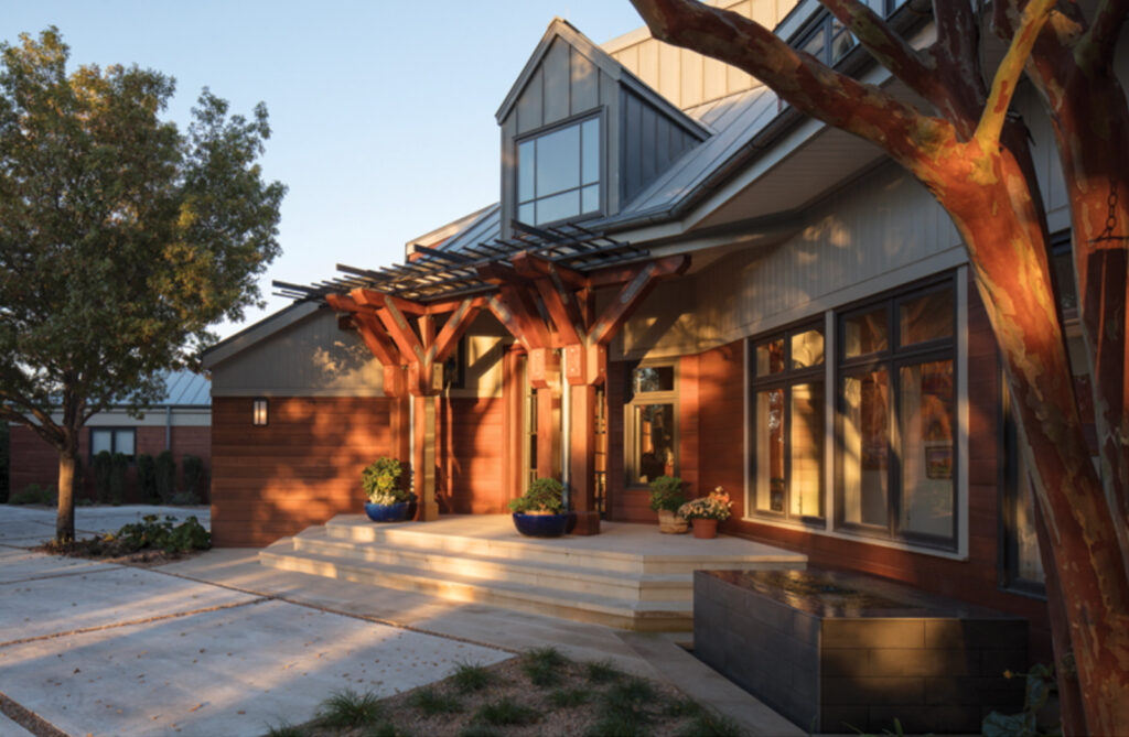
One of the highest priorities of the project, notes Furman, was to preserve and magnify the sense of arrival into the house, through it, and back out of it, and then on to the posterior living spaces outside. FKA, in collaboration with Ten Eyck Landscape Architects and The Garden Design Studio, removed the large concrete parking area that wasn’t contributing to the sense of movement. In its place, there is a generous parking court composed of sizeable concrete squares, with a grid of wide gravel joints and aligned with the rotated geometry of the entry hall. It carefully balances the scale between car and person and connects the visitor to the progression of the house.
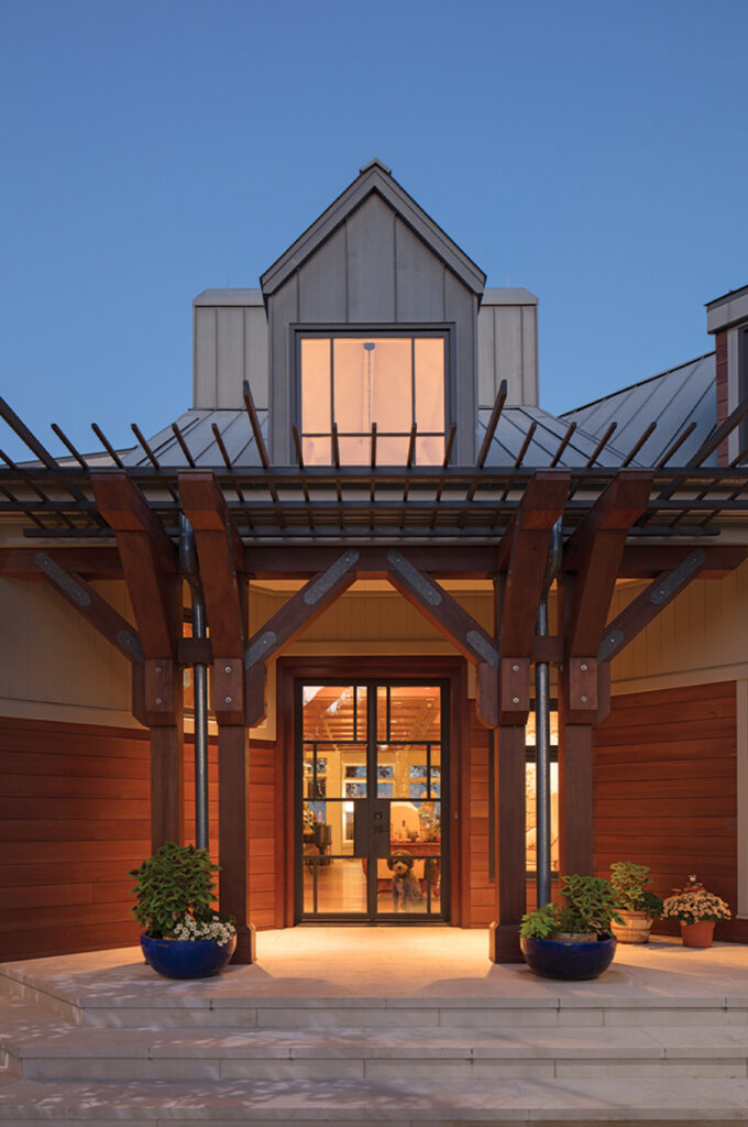
The overall formation of the house is an ‘L’ bisected by a large diagonal space through its base. Internally, the eastward-facing angle sets apart the foyer and living area, while from the exterior position, it enunciates the entrance as the primary event on the facade. Its frontispiece of exaggerated columns and an ascending roof, like a blanket propped up by the columns, invites arrival into this childhood-like fort. To make this point more emphatic, yet less abrupt, Furman enhanced the details of the entryway. The previously “flat” columns were copied/rotated into their current form and a comblike visor of delicate metal bars was then added to the plane above.
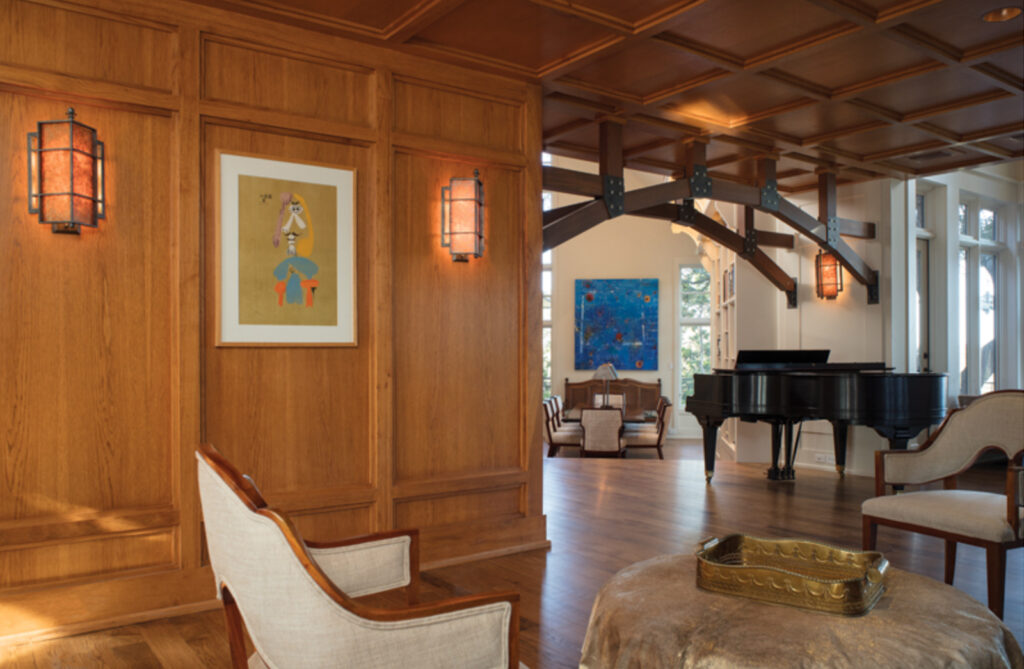
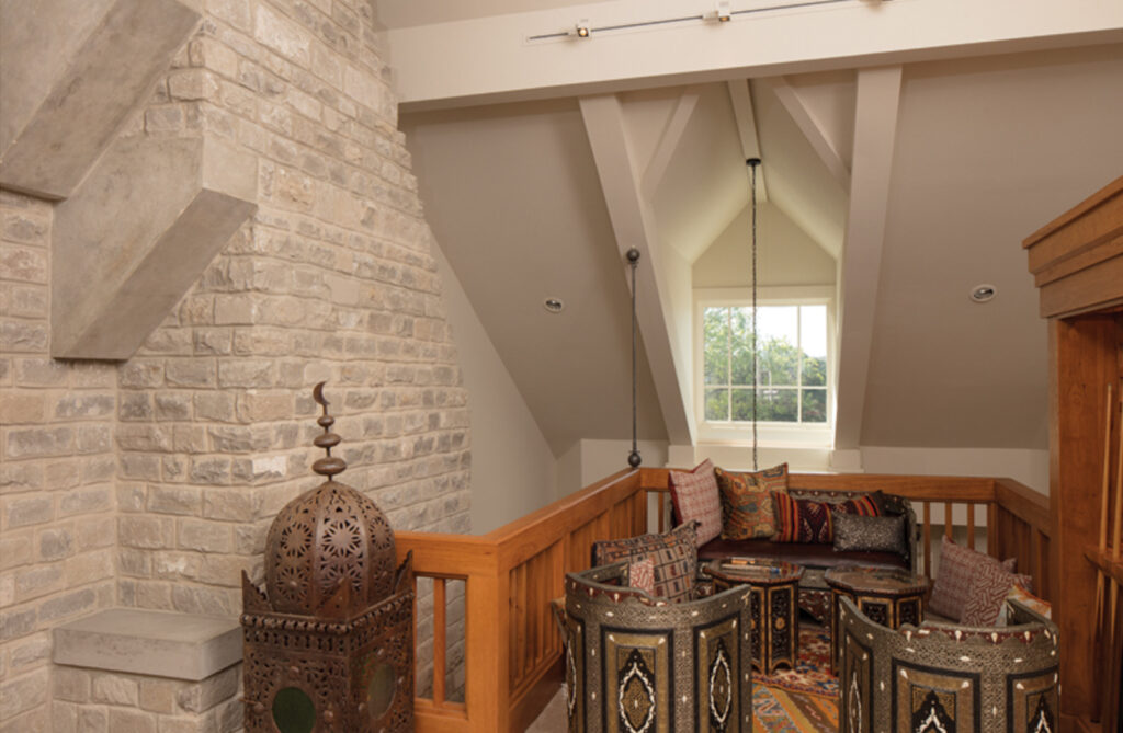
Once through the entryway, one finds the great hall. With a large stone hearth and socially-oriented sitting areas, Moore would have called this the heart of the house. The family bedrooms and master suite extend southwest from this axis. These areas, along with the great hall and dramatically suspended wood mezzanine above are only touched lightly by FKA, and sometimes not at all.
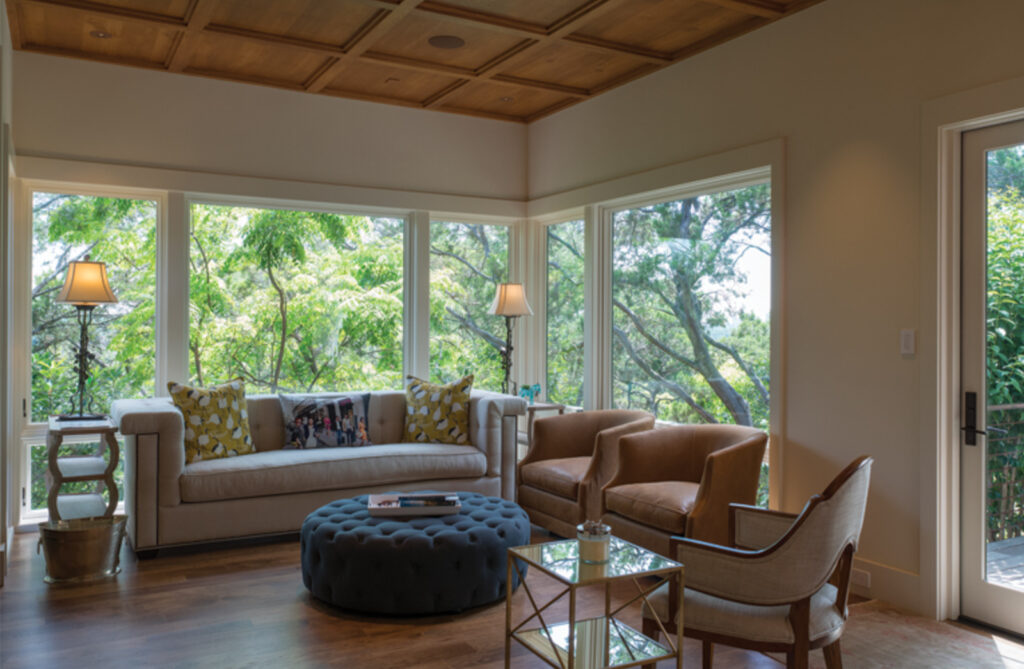
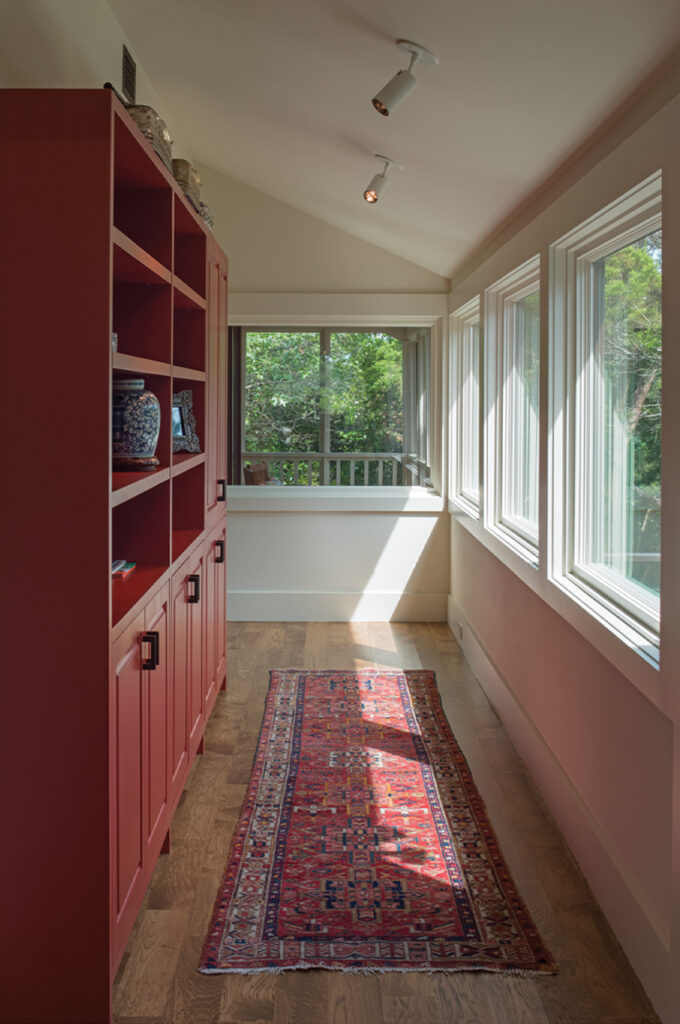
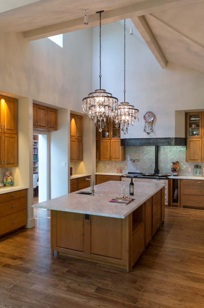
Stretching to the northwest, through a playful wood arch and down a few steps, lies the belly of the house. It includes a book-lined dining room, large kitchen, garage, and other service areas. In need of a space consistent with their lifestyle, the Woodys asked for an informal room dedicated to casual living. FKA added a comfortable family den that extends outward from the kitchen — discreet enough to defer to the original house, engaged enough to invite routine use. At the end of this wing, the studio (not in use) and a wraparound screen porch were converted into a secluded guest suite.
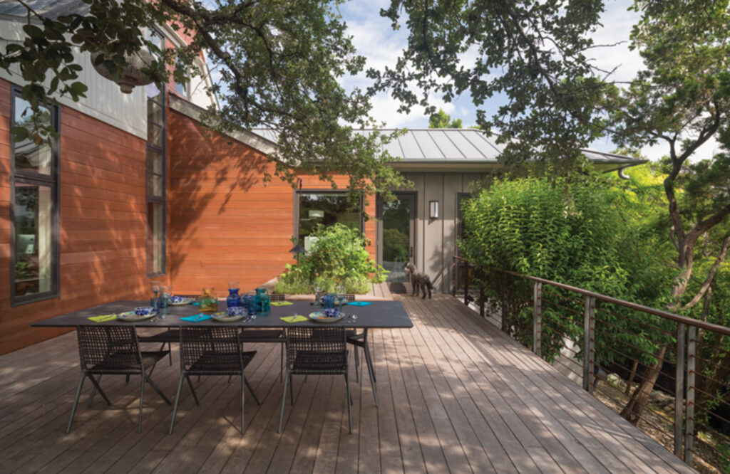
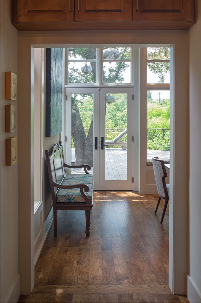
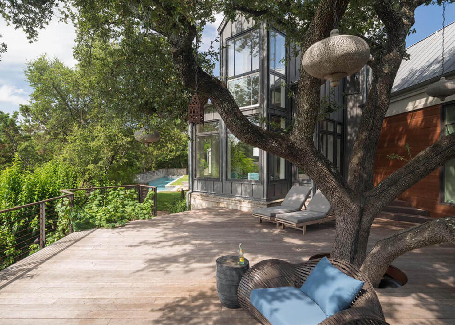
Observing that circulation through the existing house is facilitated by a strong hierarchy of spaces, FKA evaluated the original soft presence of the outdoor living space in the back. In order to provide a more pronounced culmination of the movement of the house, they created an encompassing view deck under the arching branches of a multi-trunked live oak tree. With the ground quickly dropping off, it is perched above and overlooks the cityscape, assertively laying claim to the backyard space.
In the final paragraph of Bloomer and Moore’s book, the authors put their finger on the one sublime characteristic of inhabitable places: “They have received generous portions of human care and energy, and they return that investment. The transaction, the gift and the return, is not accurately measurable in cost and efficiency; it is much more truly seen as a donation of our vivid and sometimes mysterious human identity.” It is a powerfully poetic statement, matched within and throughout Moore’s work, and, in this particular case, enriched by the work of FKA.
